Rally SpotterTitle: Long-Side Rally Detector – Quickly Spot Significant Upward Movements for In-Depth Analysis
Description:
Introducing the Long-Side Rally Detector or Rally Spotter, a powerful Pine Script designed to help traders and investors quickly identify areas on a chart where stocks have made significant upward rallies. This tool is perfect for anyone looking to easily locate these areas and conduct a deep study of the chart to uncover the underlying dynamics of these movements.
Purpose:
The primary goal of the Long-Side Rally Detector is to facilitate the identification of significant rallies, allowing you to delve deeper into the chart and gain valuable insights into market behavior. Once such an area is identified, you can perform a detailed analysis to understand:
When the Move Started: Pinpoint the exact moment the rally began.
How the Move Started: Analyze the initial triggers and catalysts for the upward movement.
The Chart Structure Before the Move: Examine the technical patterns and formations preceding the rally.
How the Volume Looked Like: Assess the volume dynamics and determine whether there was strong buying interest.
What Were the EPS, Sales Figures Before and After the Move: Investigate the fundamental metrics, such as earnings per share (EPS) and sales, to see how they align with the price movement.
Features:
Customizable Percentage Move: Set your preferred percentage increase to detect rallies, with a default value of 50%. This flexibility allows you to tailor the tool to various market conditions and trading strategies.
Adjustable Lookback Period: Define the lookback period in months (default is 3 months) to capture significant trends. The script intelligently adjusts the lookback period based on your chart's timeframe, whether daily, weekly, or monthly.
Focused on Upward Movements: Specifically engineered to identify long-side rallies, ensuring you capture only the most promising upward trends in stock prices.
Visual Highlighting: The script highlights areas on the chart where the stock has made the specified upward move, providing a clear and intuitive visual cue for analysis.
How to Use:
Apply the Script: Add the Long-Side Rally Detector to your TradingView chart.
Customize Settings: Use the input panel to adjust the percentage move and lookback period to fit your analysis needs.
Analyze with Confidence: Utilize the visual cues to identify significant upward movements and make informed trading decisions.
Ideal For:
Traders seeking to capitalize on momentum and trend-following strategies.
Investors looking to identify potential breakout opportunities in their portfolios.
Analysts interested in enhancing their technical analysis toolkit with a precise and customizable indicator.
Unlock the potential of your trading strategy with the Long-Side Rally Detector and stay ahead of the market by spotting key upward movements with ease! Conduct in-depth studies of identified areas to gain a comprehensive understanding of market dynamics.
Cerca negli script per "the script"
nPOC Levels by Tyler### Explanation of the Pine Script
This Pine Script identifies and displays weekly naked Points of Control (nPOCs) on a TradingView chart. An nPOC represents a Point of Control (POC) from a previous week that has not been revisited by price action in subsequent weeks. These nPOCs are extended to the right as horizontal lines, indicating potential support or resistance levels.
#### Script Overview
1. **Indicator Declaration:**
```pinescript
//@version=5
indicator("Weekly nPOCs", overlay=true)
```
- The script is defined as a version 5 Pine Script.
- The `indicator` function sets the script's name ("Weekly nPOCs") and specifies that the indicator should be overlaid on the price chart (`overlay=true`).
2. **Function to Calculate POC:**
```pinescript
f_poc(_hl2, _vol) =>
var float vol_profile = na
if (na(vol_profile))
vol_profile := array.new_float(100, 0.0)
_bin_size = (high - low) / 100
for i = 0 to 99
if _hl2 >= low + i * _bin_size and _hl2 < low + (i + 1) * _bin_size
array.set(vol_profile, i, array.get(vol_profile, i) + _vol)
max_volume = array.max(vol_profile)
poc_index = array.indexof(vol_profile, max_volume)
poc_price = low + poc_index * _bin_size + _bin_size / 2
poc_price
```
- The function `f_poc` calculates the Point of Control (POC) for a given period.
- It takes two parameters: `_hl2` (the average of the high and low prices) and `_vol` (volume).
- A volume profile array (`vol_profile`) is initialized to store volume data across different price bins.
- The price range between the high and low is divided into 100 bins (`_bin_size`).
- The function iterates over each bin, accumulating the volumes for prices within each bin.
- The bin with the maximum volume is identified as the POC (`poc_price`).
3. **Variables to Store Weekly Data:**
```pinescript
var float poc = na
var float prev_poc = na
var line poc_lines = na
if na(poc_lines)
poc_lines := array.new_line(0)
```
- `poc` stores the current week's POC.
- `prev_poc` stores the previous week's POC.
- `poc_lines` is an array to store lines representing nPOCs. The array is initialized if it is `na` (not initialized).
4. **Calculate Weekly POC:**
```pinescript
is_new_week = ta.change(time('W')) != 0
if (is_new_week)
prev_poc := poc
poc := f_poc(hl2, volume)
if not na(prev_poc)
line new_poc_line = line.new(x1=bar_index, y1=prev_poc, x2=bar_index + 100, y2=prev_poc, color=color.red, width=2)
label.new(x=bar_index, y=prev_poc, text="nPOC", style=label.style_label_down, color=color.red, textcolor=color.white)
array.push(poc_lines, new_poc_line)
```
- `is_new_week` checks if the current bar is the start of a new week using the `ta.change(time('W'))` function.
- If it's a new week, the previous week's POC is stored in `prev_poc`, and the current week's POC is calculated using `f_poc`.
- If `prev_poc` is not `na`, a new line (`new_poc_line`) representing the nPOC is created, extending it to the right (for 100 bars).
- A label is created at the `prev_poc` level, marking it as "nPOC".
- The new line is added to the `poc_lines` array.
5. **Remove Old Lines:**
```pinescript
if array.size(poc_lines) > 52
line.delete(array.shift(poc_lines))
```
- This section ensures that only the last 52 weeks of nPOCs are kept to avoid cluttering the chart.
- If the `poc_lines` array contains more than 52 lines, the oldest line is deleted using `array.shift`.
6. **Plot the Current Week's POC as a Reference:**
```pinescript
plot(poc, title="Current Weekly POC", color=color.blue, linewidth=2, style=plot.style_line)
```
- The current week's POC is plotted as a blue line on the chart for reference.
#### Summary
This script calculates and identifies weekly Points of Control (POCs) and marks them as nPOCs if they remain untouched by subsequent price action. These nPOCs are displayed as horizontal lines extending to the right, providing traders with potential support or resistance levels. The script also manages the number of lines plotted to maintain a clear and uncluttered chart.
Futures Settlement [NeoButane]Traders use settlement prices as both support/resistance and as a target for price to trend towards. The intention of this script is to provide possible entry and exit levels for swing and scalp trades by drawing horizontal lines of true settlement prices provided by TradingView.
The settlement price, which is calculated daily, is used to determine the profit/loss of a trader's futures position. Prior to the daily close, price settlement of futures contracts is performed by taking the average of its traded price during a specified period of time.
Usage
The settlement prices, shown as horizontal lines, serve as support or resistance for entry or exit. There are hundreds of ways to combine this with favorite indicators, or it can be used as levels for pure price action traders.
See how settlement price levels can be used in confluence with oscillators.
Configuration
Toggles to show each settlement. Reprint shows prior weeks or months after they've ended. Back-adjusted futures, which affect expired futures price history on continuous futures charts, should only be enabled on non-standard charts to match the user's chart settings.
What this script does
This script plots the daily, weekly, and monthly settlements for futures, including an average for the two most recent weekly or monthly settlements. The weekly settlement uses the last day of the week's daily settlement and the monthly settlement uses the last day of the month's daily settlement. For symbols that do not have settlement prices, which will be almost if not all symbols that are not futures, the settlement price instead becomes price at the last second before the daily/weekly/monthly close. In those cases, this script becomes a tool for automatically plotting daily/weekly/monthly closes.
See below for two different bitcoin charts. The chart on top is a non-futures chart and a futures chart is at the bottom. Note that CME bitcoin futures settle 4 hours (1500 CST) before bitcoin's daily close (UTC).
How this script works
TradingView has a built-in ability to display daily settlements instead of the actual daily close. This can be enabled in chart settings for futures on the daily timeframe and there is an argument for Pine Script to do so as well. Because settlement times are different for multiple products during the day, the script uses the settlement price from daily timeframe, which is guaranteed to be correct because TradingView is wonderful. I accidentally found the undocumented backadjustment and settlement_at_close when I was trying to use ticker.inherit() to create a symbol with its daily close time changed to another symbol's, which I still haven't figured out. TradingView has since added documentation for both of them, but there's still an ambiguous 'etc.' in the description of ticker.inherit() so maybe there's more secret arguments...
The script is able to be used on non-standard charts by using ticker.standard(), but back-adjustment will need to be changed by input to match chart settings.
References
Investopedia explanation of settlement price.
www.investopedia.com
Settlement prices for ES.
www.cmegroup.com
CME summary of settlement price.
www.cmegroup.com
How to enable settlement price as close for daily intervals in TradingView. This does not affect the use of this script.
www.tradingview.com
About back-adjustment for continuous futures charts in TradingView.
www.tradingview.com

Gaussian Weighted Moving Average with Forecast [CHE]Presentation for TradingView: Gaussian Weighted Moving Average with Forecast
Introduction
Welcome to our presentation on the "Gaussian Weighted Moving Average with Forecast" (GWMA). This script, written in Pine Script™, offers an enhanced method for analyzing and predicting price movements on TradingView. The script combines Gaussian Weighted Moving Averages and polynomial regression to provide accurate and customizable forecasts.
Overview
Title: Gaussian Weighted Moving Average with Forecast
Author: chervolino
License: Mozilla Public License 2.0
Main Features
1. Gaussian Weighted Moving Average (GWMA):
- Calculates a weighted moving average using a Gaussian weighting function.
- Parameters for length and standard deviation allow fine-tuning of the smoothing effect.
2. Polynomial Regression with Forecast:
- Creates a model to predict future price movements.
- Adjustable length and degree of polynomial regression.
- Option to extrapolate predictions and visualize them.
3. Visual Representation:
- Uses lines and colors to depict trend changes.
- Customizable colors for upward and downward trends.
Input Parameters
Length: Length of the moving average (default: 50)
Standard Deviation: Standard deviation for Gaussian weighting (default: 10.0)
Width: Width of the plotted lines (default: 1)
Colors: Customizable colors for upward and downward trends
Forecast Length: Length of the forecast period (default: 20)
Extrapolate Length: Length of the extrapolation (default: 50)
Polynomial Degree: Degree of the polynomial regression (default: 3)
Lock Forecast: Option to lock and stabilize the forecast
Core Algorithms
1. Gaussian Weight Calculation:
gaussian_weight(x, std_dev) =>
1 / (std_dev * math.sqrt(2 * math.pi)) * math.exp(-0.5 * math.pow(x / std_dev, 2))
2. GWMA Calculation:
calculate_gwma(length, std_dev) =>
// Algorithm to calculate the weighted moving average
3. Initialize Lines for Polynomial Regression:
initialize_lines_array(extrapolate, length) =>
// Initialize array lines
4. Create Design Matrix for Polynomial Regression:
get_design_matrix(length, degree) =>
// Create the design matrix
5. Calculate and Plot Polynomial Regression:
calculate_polynomial_regression(src, length, degree, extrapolate, lines_arr, lock, width, upward_color, downward_color) =>
// Algorithm to calculate polynomial regression and plot the forecast
Combining Indicators: Originality and Usefulness
The combination of Gaussian Weighted Moving Average and polynomial regression provides traders with a robust tool for trend analysis and prediction. The GWMA smooths out price data while emphasizing recent prices, making it sensitive to short-term trends. Polynomial regression, on the other hand, offers a mathematical approach to model and forecast future prices based on historical data. By integrating these two methodologies, traders can achieve a more comprehensive view of market trends and potential future movements, making the tool highly valuable for decision-making.
Explanation for Users
Most TradingView users are not familiar with Pine Script, so a clear description is essential for understanding how to use the script.
Gaussian Weighted Moving Average (GWMA): This indicator calculates a moving average using Gaussian weights, which gives more importance to recent prices. The length and standard deviation parameters allow users to control the sensitivity and smoothness of the average.
Polynomial Regression with Forecast: This feature uses polynomial regression to model the price trend and predict future movements. Users can adjust the length of the historical data used, the degree of the polynomial, and the length of the forecast. The script plots these predictions, making it easier for traders to visualize potential future price paths.
Visualization of Results
1. GWMA Plotting:
plot(gaussian_ma_result, title="GWMA", color=line_color, linewidth=width_input)
2. Forecast Extrapolation:
plot(forecast_val, 'Extrapolation', offset=extrapolate_setting, linewidth=width_input, style=plot.style_circles)
Conclusion
The "Gaussian Weighted Moving Average with Forecast" script provides a powerful tool for analyzing and predicting price movements on TradingView. By combining Gaussian weighting and polynomial regression, it offers a precise and customizable method for trend analysis and forecasting.
Thank you for your attention! For any questions or further information, please feel free to reach out.

Multi-Timeframe Period Separator [CHE]Multi-Timeframe Period Separator
Introduction
- Purpose: This TradingView script is designed to help traders by automatically drawing period separators on the chart based on various timeframes.
- Benefits: Enhances chart readability, provides better visualization of time periods, and supports multiple timeframe types.
Features
1. Timeframe Selection:
- Auto Timeframe
- Multiplier
- Manual
2. Customization Options:
- Separator color
- Separator style
- Separator width
3. Display Options:
- Time period information box
- Customizable size and position of the info box
Code Breakdown
1. Timeframe Type Selection
- Options: Users can choose between "Auto Timeframe," "Multiplier," and "Manual." A multiplier can be set for the alternate resolution.
2. Resolution Calculation
- Automatic, Multiplier, and Manual Resolution Calculation: The resolution is calculated based on the selected timeframe type.
3. Automatic Timeframe Function
- Dynamic Timeframe Calculation: A function for automatically calculating the appropriate timeframe based on the current chart resolution.
4. Drawing the Separators
- Drawing Separators on the Chart: Separators are drawn based on the selected timeframe and the user's customization options.
5. Display of the Time Period
- Information Box Settings: Users can enable the display of an information box showing the current timeframe. The size, position, and colors of the box can be customized.
- Displaying the Time Period in the Information Box: If enabled, the information box shows the current time period.
Usage
1. Loading the Script: Add the script to your TradingView chart.
2. Setting Timeframe Type: Choose from Auto, Multiplier, or Manual.
3. Customizing Separators: Adjust the color, style, and width of the separators to your preference.
4. Displaying the Time Period: Enable the information box to show the current timeframe.
Conclusion
- Summary: This script provides a robust solution for traders who need clear visual separation of different time periods on their charts.
- Customization: Flexible options allow you to tailor the appearance and functionality to suit your trading style.

Supertrend + BB + Consecutive Candles + QQE + EMA [Pineify]Overview
This indicator, developed by Pineify, is a comprehensive tool designed to assist traders in making informed decisions by combining multiple technical analysis methods. It integrates Supertrend, Bollinger Bands (BB), Consecutive Candles, Quantitative Qualitative Estimation (QQE), and Exponential Moving Averages (EMA) into a single, cohesive script. This multi-faceted approach allows traders to analyze market trends, volatility, and potential buy/sell signals with greater accuracy.
Key Features
1. Supertrend: Utilizes the Supertrend indicator to identify the prevailing market trend. It provides clear buy and sell signals based on the direction of the trend.
2. Bollinger Bands (BB): Measures market volatility and identifies overbought or oversold conditions. The script calculates the middle, upper, and lower bands, along with the Bollinger Band Width (BBW) and Bollinger Band %B (BBR).
3. Consecutive Candles: Detects sequences of consecutive bullish or bearish candles, providing signals when a specified number of consecutive candles are detected.
4. Quantitative Qualitative Estimation (QQE): Combines the Relative Strength Index (RSI) with a smoothing factor to generate buy and sell signals based on the QQE methodology.
5. Exponential Moving Averages (EMA): Includes both fast and slow EMAs to identify potential crossovers, which are used as buy and sell signals.
How It Works
- Supertrend: The Supertrend indicator is calculated using a factor and ATR length. It plots the trend direction and generates buy/sell signals when the trend changes.
- Bollinger Bands: The BB indicator calculates the middle band as a Simple Moving Average (SMA) of the closing prices. The upper and lower bands are derived by adding and subtracting a multiple of the standard deviation from the middle band.
- Consecutive Candles: This feature counts the number of consecutive candles that close higher or lower than the previous candle. When the count reaches a specified threshold, it generates a buy or sell signal.
- QQE: The QQE indicator smooths the RSI values and calculates the QQE Fast and QQE Slow lines. Buy and sell signals are generated based on the crossover of these lines.
- EMA: The script calculates fast and slow EMAs and generates buy/sell signals based on their crossovers.
How to Use
1. Inputs: Customize the indicator settings through the input parameters:
- Supertrend Factor and ATR Length
- BB Length
- Consecutive Candles Counting
- QQE RSI Length
- Fast and Slow EMA Lengths
- Enable/Disable Alerts for various signals
2. Alerts: Set up alerts for Supertrend, Consecutive Candles, and EMA crossovers. Alerts can be enabled or disabled based on user preference.
3. Visualization: The indicator plots the Supertrend, Bollinger Bands, and EMA lines on the chart. It also marks buy and sell signals with arrows and labels for easy identification.
Concepts Underlying Calculations
- Supertrend: Based on the Average True Range (ATR) to determine the trend direction and potential reversal points.
- Bollinger Bands: Utilizes standard deviation to measure market volatility and identify overbought/oversold conditions.
- Consecutive Candles: A method to detect momentum by counting consecutive bullish or bearish candles.
- QQE: Enhances the traditional RSI by smoothing it and using a dynamic threshold to generate signals.
- EMA: A widely used moving average that gives more weight to recent prices, making it responsive to market changes.
This indicator is a powerful tool for traders looking to combine multiple technical analysis methods into a single, easy-to-use script. By integrating these diverse techniques, it provides a comprehensive view of market conditions and potential trading opportunities.

Open Interest liquidation map [Ox_kali]This script is inspired by @LeviathanCapital work on aggregating Open Interest , as presented in the Open Interest Suite Aggregated script. This script aims to provide a liquidation map of Open Interest by identifying significant anomalies across multiple trading platforms. By integrating data from Binance, BitMEX, and Kraken, this script tries to offer a comprehensive and detailed view of Open Interest movements and attempts to define zones of interest.
Key Points
1. Multiple Data Sources : The script retrieves Open Interest data from several trading platforms, including Binance (USDT, USD, BUSD), BitMEX (USD, USDT), and Kraken (USD).
2. Anomaly Detection : Utilizes a simple moving average (SMA) to calculate the average size of Open Interest candles and identify anomalies based on a user-specified size factor.
3. Background Coloring : Offers an option to color the background of the charts based on detected anomalies, allowing for clear visualization of significant movements.
4. Dynamic Support and Resistance Zones : Defines and dynamically updates support and resistance zones based on Open Interest anomalies.
5. Alerts : Configures alerts to notify the user when an Open Interest anomaly is detected.
Trading Utility
This script can be useful for monitoring significant changes in Open Interest and potential liquidation zones across multiple platforms. The main trading applications include:
1. Identifying Liquidation Points : By detecting Open Interest anomalies, it is possible to identify potential liquidation points where significant price movements might occur.
2. Multi-Platform Analysis : By aggregating Open Interest data from multiple platforms, a more comprehensive market overview is obtained.
3. Detecting Support and Resistance Zones : Dynamic support and resistance zones help identify key price levels where trend reversals might occur.
4. Customized Alerts: Anomaly alerts allow for automated responses to market changes.
Conclusion
The “Open Interest liquidation map ” script is an experimental tool for analyzing Open Interest across multiple trading platforms. Inspired by Leviathan’s work, this script attempts to identify liquidation and interest zones. This is an experimental version, and I welcome any comments and feedback for improvement.
Please note that the Open Interest liquidation map is not a guarantee of future market performance and should be used in conjunction with proper risk management. Always ensure that you have a thorough understanding of the indicator’s methodology and its limitations before making any investment decisions. Additionally, past performance is not indicative of future results.
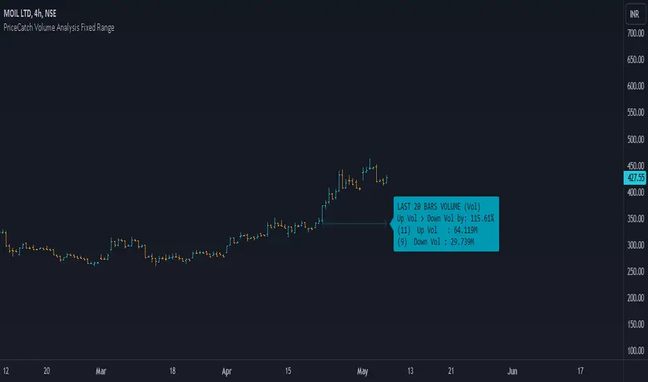
PriceCatch Volume Analysis Fixed RangeHi TV Community.
It's been sometime since I published any script / utility. But today, I am back with a new script.
Volume Analysis
Studying volume when in trade or before taking one is very important as seasoned traders would tell you. So, this script helps you to look at volume over a specific interval from current bar. You will have to set the look-back period in the settings dialog.
The script will then show over that period :
Number of Up and Down bars
Volume Ratio of Up Volume over Down Volume
Actual Up and Down Volume
Percentage of Up Volume to Down Volume
I use this information in all my trades and hope that you will also find this Script useful.
To my knowledge, I have not seen another volume analysis script that helps see volume in the way this script does.
NOTE:
This script does not give any buy or sell signal if that is what you are looking for. But if you see that Up Volume is 3 times Down Volume, then that should mean something to you. So also when price is slipping down.
Disclaimer
I am sharing this Script without any warranties as to its usability. Use it only if you like it. As always when it comes to trading you and you alone are responsible for your actions.
All the best with your trades.
PriceCatch
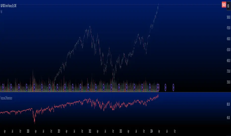
Fractional Differentiation█ Description
This Pine Script indicator implements fractional differentiation, a mathematical operation that extends the concept of differentiation to non-integer orders. Fractional differentiation is particularly significant in financial analysis, as it enables analysts to uncover underlying patterns in price series that are not evident with traditional integer-order differentiation. The motivation behind fractional differencing lies in its ability to balance the trade-off between retaining data/feature memory and ensuring stationarity.
█ Significance
Fractional differentiation offers a nuanced view of market data, allowing for the adjustment of the differentiation order to balance between signal clarity and noise reduction. This is especially useful in financial markets, where the choice of differentiation order can highlight long-term trends or short-term price movements without completely smoothing out the valuable market noise.
█ Approximations Used
The implementation relies on the Gamma function for the computation of coefficients in the fractional differentiation formula. Given the complexity of the Gamma function, this script uses an approximation method based on the Lanczos approximation for the logarithm of the Gamma function, as detailed in "An Analysis Of The Lanczos Gamma Approximation" by Glendon Ralph Pugh (2004). This approximation strikes a balance between computational efficiency and accuracy, making it suitable for real-time market analysis in Pine Script.
█ Limitations
While this script opens new avenues for market analysis, it comes with inherent limitations:
- The approximation of the Gamma function, although accurate, is not exact. The precision of the fractional differentiation result may vary slightly, especially for higher-order differentiations.
- The script's performance is subject to Pine Script's execution environment, with a default loop limit set to 100 iterations for practicality. Users might need to adjust this limit based on their specific use case, balancing between computational load and the desired depth of historical data analysis.
█ Credits
This script makes use of the `MathSpecialFunctionsGamma` library, authored by Ricardo Santos . This library provides essential mathematical functions, including an approximation of the Gamma function, which is crucial for the fractional differentiation calculation.
I also extend my sincere gratitude to
Dr. Marcos López de Prado for his seminal work, Advances in Financial Machine Learning (2018). Dr. López de Prado's insights have significantly influenced our approach to developing sophisticated analytical tools.
Dr. Ernie Chan for his freely and generously sharing valuable insights via discourse on quantitative trading strategies through his talks and publications.
Liquidity SpotterIndicator Setup:
The script sets up a TradingView indicator titled "Liquidity Spotter" with a short title "PWWTC LS". It's designed to overlay on the price chart (overlay=true).
Input Variables:
The script defines input variables that allow users to customize the behavior of the indicator:
atr_length: Length of the Average True Range (ATR) used in calculations.
volume_multiplier: Multiplier used to compare the volume of the current bar with the average volume.
range_multiplier: Multiplier used to calculate the range condition.
highlight_color: Color used to highlight bars when conditions are met.
Calculations:
The script calculates the ATR and average volume using the ta.atr and ta.sma functions provided by TradingView's Pine Script.
It sets the avg_range to the value of the ATR, essentially making it the same as atr_value.
Conditions:
The script checks several conditions based on the calculated values:
range_condition: Compares the range (high - low) of the current bar with the average range multiplied by the range multiplier.
volume_condition: Compares the volume of the current bar with the average volume multiplied by the volume multiplier.
range_volume_condition: Compares the ratio of range to volume with the ratio of average range to average volume.
Plotting:
Based on the conditions being met or not, the script sets the color of the price bars. If all conditions are met, the color of the bars will be set to highlight_color, otherwise, it will remain unchanged (na).
Overall, this script visually highlights price bars on the chart where specific conditions related to range, volume, and their ratio are met, potentially indicating trading opportunities.

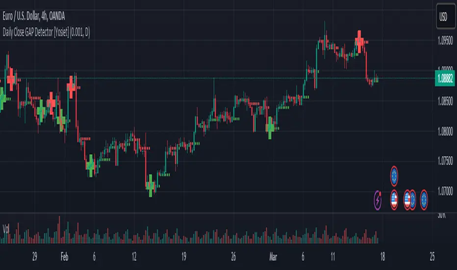
Daily Close GAP Detector [Yosiet]User Manual for "Daily Close GAP Detector "
Overview
This script is designed to help traders identify and react to significant gaps in daily market prices. It plots daily open and close prices and highlights significant gaps with a cross. The script is particularly useful for identifying potential breakouts or reversals based on these gaps.
Configuration
GAP Close Threshold: This input allows you to set a threshold for the gap size that you consider significant. The default value is 0.001.
Timeframe Seeker: This input lets you choose the timeframe for the gap detection. The default is 'D' for daily.
Features
Daily Open and Close Lines: The script plots daily open and close prices. If the close price is lower than the open price, the line is colored red; otherwise, it's green.
Gap Detection: It calculates the difference between the current day's close and the previous day's close, both adjusted for the selected timeframe. If this difference exceeds the threshold, it's considered a significant gap.
Significant Gap Indicator: A cross is plotted on the chart to indicate significant gaps. The color of the cross indicates whether the gap is a short or long gap: red for short gaps and green for long gaps.
Alert Conditions: The script sets up alert conditions for short and long gap breakouts. You can customize the alert messages to include details like the ticker symbol, interval, price, and exchange.
How to Use
Add the Script to Your Chart: Copy the script into the Pine Script editor on TradingView and add it to your chart.
Configure Inputs: Adjust the "GAP Close Threshold" and "Timeframe Seeker" inputs as needed.
Review the Chart: The script will overlay daily open and close prices on your chart, along with crosses indicating significant gaps.
Set Alerts: Use the script's alert conditions to set up alerts for short and long gap breakouts. You can customize the alert messages to suit your trading strategy.
Extending the Code
To extend this script, you can modify the gap detection logic, add more indicators, or integrate it with other scripts for a more comprehensive trading strategy. Remember to test any changes thoroughly before using them in live trading.
Kzx | RSI + Div + MACDComponents Description:
Relative Strength Index (RSI):
Purpose: Measures the magnitude of recent price changes to evaluate overbought or oversold conditions in the price of a stock or other asset.
Implementation: The script allows users to set the length of the RSI calculation and defines overbought and oversold levels, which can be visually represented on the chart. Additional features include options to fill and/or color the background of the chart when overbought or oversold levels are reached.
Divergence (Div):
Purpose: Identifies instances where the price of an asset is moving in the opposite direction of a momentum indicator, such as the RSI in this script. Divergences can signal potential trend reversals.
Implementation: The script provides options for users to define the conditions under which divergences are identified, including the source of price tops/bottoms, detection limits, and the maximum lookback period for divergence analysis. It visually highlights these divergences on the chart.
Moving Average Convergence Divergence (MACD):
Purpose: Tracks the relationship between two moving averages of a security's price. The MACD is used to identify trend direction, momentum, and potential reversal points through crossovers.
Implementation: The script calculates the MACD line and its signal line. It plots buy or sell markers based on crossovers between these two lines, indicating potential entry or exit points.
Script Category:
Category: Technical Analysis / Indicators and Strategies
Subcategory: Oscillators (for RSI and MACD) and Trend Analysis (for Divergence)
Usage:
The script is designed for traders and analysts who rely on technical analysis to make informed decisions in the financial markets. By integrating RSI, divergence detection, and MACD analysis into a single script, users can gain a more nuanced understanding of market conditions, potentially improving their trading strategies.
Customization and Visualization:
Users can customize various parameters, including lengths for RSI and MACD, overbought/oversold levels, divergence detection criteria, and visual aspects like colors and marker sizes.
The script provides visual cues directly on the price chart, making it easy to spot potential buy/sell signals, overbought/oversold conditions, and divergences without the need to switch between different indicators.

BreakoutTrendFollowingINFO:
The "BreakoutTrendFollowing" indicator is a comprehensive trading system designed for trend-following in various market environments. It combines multiple technical indicators, including Moving Averages (MA), MACD, and RSI,
along with volume analysis and breakout detection from consolidation, to identify potential entry points in trending markets. This strategy is particularly effective for assets that exhibit strong trends and significant price movements.
Note that using the consolidation filter reduces the amount of entries the strategy detects significantly, and needs to be used if we want to have an increased confidence in the trend via breakout.
However, the strategy can be easily transformed to various only trend-following strategies, by applying different filters and configurations.
The indicator can be used to connect to the Signal input of the TTS (TempalteTradingStrategy) by jason5480 in order to backtest it, thus effectively turning it into a strategy (instructions below in TTS CONNECTIVITY section)
DETAILS:
The strategy's core is built upon several key components:
Moving Average (MA): Used to determine the general trend direction. The strategy checks if the price is above the selected MA type and length.
MACD Filter: Analyzes the relationship between two moving averages to confirm the trend's momentum.
Consolidation Detection: Identifies periods of price consolidation and triggers trades on breakouts from these ranges.
Volume Analysis: Assesses trading volume to confirm the strength and validity of the breakout.
RSI: Used to avoid overbought conditions, ensuring trades are entered in favorable market situations.
Wick filters: make sure there is not a long wick that indicates selling pressure from above
The strategy generates buy signals when several conditions are met concurrently (each one of them can be individually enabled/disabled)"
The price is above the selected MA.
A breakout occurs from a configurable consolidation range.
The MACD line is above the signal line, indicating bullish momentum.
The RSI is below the overbought threshold.
There's an increase in trading volume, confirming the breakout's strength.
Currently the strategy fires SL signals, as the approach is to check for loss of momentum - i.e. crossunder of the MACD line and signal line, but that is to everyone to determine the exit conditions.
The buy and SL signals are set on the chart using green or orange triangles on the below/above the price action.
SETTINGS:
Users can customize various parameters, including MA type and period, MACD settings, consolidation length, and volume increase percentage. The strategy is equipped with alert conditions for both entry (buy signals) and exit (set stop loss) points, facilitating both manual and automated trading.
Each one of the technical indicators, as well as the consilidation range and breakout/wick settings can be configured and enabled/disabled individually.
Please thoroughly review the available settings of the script, but here is an outline of the most important ones:
Use bar wicks (instead of open/close) - the ref_high/low will be taken based on the bar wicks, rather than the open/close when determining the breakout and MA
Enter position only on green candles - additional filters to make sure that we enter only on strong momentum
MA Filter: (enable, source, type, length) - general settings for MA filter to be checked against the stock price (close or upper wick)
MACD Filter: (enable, source, Osc MA type, Signal MA type, Fast MA length, Slow MA length, Low MACD Hist) - detailed settings for fine MACD tuning
Consolidation:
Consolidation Type: we have two different ways of detecting the consolidation, note the types below.
CONSOLIDATION_BASIC - consolidation areas by looking for the pivot point of a trend and counts the number of bars that have not broken the consolidation high/low levels.
CONSOLIDATIO_RANGE_PERCENT - identifies consolidation by comparing the range between the highest and lowest price points over a specified period.
So in summary the CONSOLIDATIO_RANGE_PERCENT uses a percentage-based range to define consolidation, while CONSOLIDATION_BASIC uses a count of bars within a high-low range to establish consolidation.
Thus the former is more focused on the tightness of the price range, whereas the latter emphasizes the duration of the consolidation phase.
The CONSOLIDATIO_RANGE_PERCENT might be more sensitive to recent price movements and suitable for shorter-term analysis, while CONSOLIDATION_BASIC could be better for identifying longer-term consolidation patterns.
Min consolidation length - applicable for CONSOLIDATION_BASIC case, the min number of bars for the price to be in the range to consider consolidation
Consolidation Loopback period - applicable for CONSOLIDATION_BASIC case, the loopback number of bars to look for consolidation
Consolidation Range percent - applicable for CONSOLIDATIO_RANGE_PERCENT, the percent between the high and low in the range to consider consolidation
Plot consolidation - enables plotting of the consolidation (only for debug purposes)
Breakout: (enable, low, high) - the definition of the breakout from the previous consolidation range, the price should be between to determine the breakout as successfull
Upper wick: (enable, percent) - defines the percent of the upper wick compared to the whole candle to allow breakout (if the wick is too big part of the candle we can consider entering the position riskier)
RSI: (enable, length, overbought) - general settings for RSI TA
Volume (enbale, percentage increase, average volume filter en, loopback bars) - percentage of increase of the volume to consider for a breakout. There are two modes - percentage increase compared to the previous bar, or percentage against the average volume for the last loopback bars.
Note that there are many different configuration that you can play with, and I believe this is the strength of the strategy, as it can provide a single solution for different cases and scenarios.
My advice is to try and play with the different options for different markets based on the approach you want to implement and try turning features on/off and tuning them further.
TTS SETTINGS (NEEDED IF USED TO BACKTEST WITH TTS):
The TempalteTradingStrategy is a strategy script developed in Pine by jason5480, which I recommend for quick turn-around of testing different ideas on a proven and tested framework
I cannot give enough credit to the developer for the efforts put in building of the infrastructure, so I advice everyone that wants to use it first to get familiar with the concept and by checking
by checking jason5480's profile www.tradingview.com
The TTS itself is extremely functional and have a lot of properties, so its functionality is beyond the scope of the current script -
Again, I strongly recommend to be thoroughly explored by everyone that plans on using it.
In the nutshell it is a script that can be feed with buy/sell signals from an external indicator script and based on many configuration options it can determine how to execute the trades.
The TTS has many settings that can be applied, so below I will cover only the ones that differ from the default ones, at least according to my testing - do your own research, you may find something even better :)
The current/latest version that I've been using as of writing and testing this script is TTSv48
Settings which differ from the default ones:
Deal Conditions Mode - External (take enter/exit conditions from an external script)
🔌Signal 🛈➡ - BreakoutTrendFollowing: 🔌Signal to TTS (this is the output from the indicator script, according to the TTS convention)
Order Type - STOP (perform stop order)
Distance Method - HHLL (HigherHighLowerLow - in order to set the SL according to the strategy definition from above)
The next are just personal preferences, you can feel free to experiment according to your trading style
Take Profit Targets - 0 (either 100% in or out, no incremental stepping in or out of positions)
Dist Mul|Len Long/Short- 10 (make sure that we don't close on profitable trades by any reason)
Quantity Method - EQUITY (personal backtesting preference is to consider each backtest as a separate portfolio, so determine the position size by 100% of the allocated equity size)
Equity % - 100 (note above)

PB wTF50What kind of traders/investors are we?
We are trend followers, always on the lookout for the next big move in the market. Our scripts are meticulously crafted for higher timeframes (daily, weekly, monthly) aiming to capture the large market trends.
What does this script do?
The Pb wTF50 script simplifies the complex world of investing by colour-coding bars to indicate the trend direction. Green bars signify a bullish trend, red indicates a bearish trend, and a combination of both signifies a sideways market. This visual representation ensures investors can quickly gauge the market's direction and act accordingly.
How is the PB wTF50 produced?
The PB wTF50 script employs the simple moving averages (SMAs) as its backbone. Bars positioned above both the SMAs turn green, indicating a bullish trend. Conversely, bars below these SMAs turn red, signalling a bearish trend.
What is the best timeframe to use the script?
The PB wTF50 script is designed for the weekly timeframe. This ensures that traders and investors are aligned with the long-term market trend, filtering out the noise of shorter timeframes.
What makes this script unique?
The challenges of identifying the onset, progression, and culmination of trends are well-known in the investing community. The PbF script addresses these challenges head-on.
The PB wTF50 is not a lagging indicator. It is aligned with price movement, which helps investors and traders focus on what the asset’s price is doing. The asset’s price is the primary indicator of its direction.
Lagging indicators can be used alongside the PB wTF50 to confirm the asset’s direction.
The PBwTF50 continues to remain green during extended periods of bullish pullbacks and red during extended periods of bearish pullbacks. This helps investors and traders hold positions during corrections in the market.
When interacting with OB/OS zones, investors and traders are positioned to align with the trend and ignore short-term fluctuations against the trend.
The PB wTF50 can be used to enter additional positions, also known as compounding, when an asset’s price has pulled back into an OS zone, but the trend filter has remained green in a bull trend/OB zone, but the trend filter has remained red in a bear trend.
In essence, the PB wTF50 script is a trend filter that gives investors and traders the ability to apply discretion with the start and end of long-term trends as they develop.

Dual_MACD_trendingINFO:
This indicator is useful for trending assets, as my preference is for low-frequency trading, thus using BTCUSD on 1D/1W chart
In the current implementation I find two possible use cases for the indicator:
- as a stand-alone indicator on the chart which can also fire alerts that can help to determine if we want to manually enter/exit trades based on the signals from it (1D/1W is good for non-automated trading)
- can be used to connect to the Signal input of the TTS (TempalteTradingStrategy) by jason5480 in order to backtest it, thus effectively turning it into a strategy (instructions below in TTS CONNECTIVITY section)
Trading period can be selected from the indicator itself to limit to more interesting periods.
Arrow indications are drawn on the chart to indicate the trading conditions met in the script - light green for HTF crossover, dark green for LTF crossover and orange for LTF crossunder.
Note that the indicator performs best in trending assets and markets, and it is advisable to use additional indicators to filter the trading conditions when market/asset is expected to move sideways.
DETAILS:
It uses a couple of MACD indicators - one from the current timeframe and one from a higher timeframe, as the crossover/crossunder cases of the MACD line and the signal line indicate the potential entry/exit points.
The strategy has the following flow:
- If the weekly MACD is positive (MACD line is over the signal line) we have a trading window.
- If we have a trading window, we buy when the daily macd line crosses AND closes above the signal line.
- If we are in a position, we await the daily MACD to cross AND close under the signal line, and only then place a stop loss under the wick of that closing candle.
The user can select both the higher (HTF) and lower (LTF) timeframes. Preferably the lower timeframe should be the one that the Chart is on for better visualization.
If one to decide to use the indicator as a strategy, it implements the following buy and sell criterias, which are feed to the TTS, but can be also manually managed via adding alerts from this indicator.
Since usually the LTF is preceeding the crossover compared to the HTF, then my interpretation of the strategy and flow that it follows is allowing two different ways to enter a trade:
- crossover (and bar close) of the macd over the signal line in the HIGH TIMEFRAME (no need to look at the LOWER TIMEFRMAE)
- crossover (and bar close) of the macd over the signal line in the LOW TIMEFRAME, as in this case we need to check also that the macd line is over the signal line for the HIGH TIMEFRAME as well (like a regime filter)
The exit of the trade is based on the lower timeframe MACD only, as we create a stop loss equal to the lower wick of the bar, once the macd line crosses below the signal line on that timeframe
SETTINGS:
All of the indicator's settings are for the vanilla/general case.
User can set all of the MACD parameters for both the higher and lower (current) timeframes, currently left to default of the MACD stand-alone indicator itself.
The start-end date is a time filter that can be extermely usefull when backtesting different time periods.
TTS SETTINGS (NEEDED IF USED TO BACKTEST WITH TTS)
The TempalteTradingStrategy is a strategy script developed in Pine by jason5480, which I recommend for quick turn-around of testing different ideas on a proven and tested framework
I cannot give enough credit to the developer for the efforts put in building of the infrastructure, so I advice everyone that wants to use it first to get familiar with the concept and by checking
by checking jason5480's profile www.tradingview.com
The TTS itself is extremely functional and have a lot of properties, so its functionality is beyond the scope of the current script -
Again, I strongly recommend to be thoroughly epxlored by everyone that plans on using it.
In the nutshell it is a script that can be feed with buy/sell signals from an external indicator script and based on many configuration options it can determine how to execute the trades.
The TTS has many settings that can be applied, so below I will cover only the ones that differ from the default ones, at least according to my testing - do your own research, you may find something even better :)
The current/latest version that I've been using as of writing and testing this script is TTSv48
Settings which differ from the default ones:
- from - False (time filter is from the indicator script itself)
- Deal Conditions Mode - External (take enter/exit conditions from an external script)
- 🔌Signal 🛈➡ - Dual_MACD: 🔌Signal to TTSv48 (this is the output from the indicator script, according to the TTS convention)
- Sat/Sun - true (for crypto, in order to trade 24/7)
- Order Type - STOP (perform stop order)
- Distance Method - HHLL (HigherHighLowerLow - in order to set the SL according to the strategy definition from above)
The next are just personal preferenes, you can feel free to experiment according to your trading style
- Take Profit Targets - 0 (either 100% in or out, no incremental stepping in or out of positions)
- Dist Mul|Len Long/Short- 10 (make sure that we don't close on profitable trades by any reason)
- Quantity Method - EQUITY (personal backtesting preference is to consider each backtest as a separate portfolio, so determine the position size by 100% of the allocated equity size)
- Equity % - 100 (note above)
EXAMPLES:
If used as a stand-alone indicator, the green arrows on the bottom will represent:
- light green - MACD line crossover signal line in the HTF
- darker green - MACD line crossover signal line in the LTF
- orange - MACD line crossunder signal line in the LTF
I recommend enabling the alerts from the script to cover those cases.
If used as an input to the TTS, we'll get more decorations on the chart from the TTS itself.
In the example below we open a trade on the next day of LTF crossover, then a few days later a crossunder in the LTF occurs, so we set a SL at the low of the wick of this day. Few days later the price doesn't recover and hits that SL, so the position is closed.

OTT CollectionIf you are not yet familiar with OTT, this script could provide an introduction to help you get started.
"Optimized Trend Tracker" (OTT) is an effective trend-following indicator created by Anıl Özekşi . It aims to detect the current trend direction based on an elegant mathematical construct. The key defining characteristic of OTT is its reliance on a trailing-stop mechanism. This enables OTT to identify price movements and follow the price until a reversal occurs. The widespread adoption of OTT in various algo-trading platforms has fostered the development of diverse applications of the indicator over time. Examining its history, eight distinct applications emerge.
1) OTT - Optimized Trend Tracker
2) TOTT - Twin Ott
3) OTT Channel - Half Channel & Fibonacci Channel
4) RISOTTO - Rsi Ott
5) SOTT - Stochastic Ott
6) HOTT & LOTT - Highest-Lowest Ott + Sum Option
7) ROTT - Relative Ott
8) FT - "Fırsatçı" Trend
BONUS: RTR - Relative True Range
Each system functions as an independent indicator and the "OTT Collection" is intended to present all of them in a single script.
ORIGINALITY
Primarily, this script introduces previously unreleased OTT applications on Tradingview (RISOTTO, ROTT, FT). In contrast to previously published examples that treat OTT as a variable, this script portrays OTT as a function, rendering it adaptable for more intricate computations. Consequently, OTT has evolved into a versatile tool capable of facilitating complex analyses. Furthermore, this script offers an innovative feature that permits the blocking of consecutive signals in the same direction, catering to user preferences. (This feature is crucial for all indicators utilizing band structures such as TOTT and HOTT-LOTT).
USAGE
It is simple to use. The settings section of the indicator groups the parameters. In first group, the System parameter allows you to select the OTT system you want to display on the chart. Activating the Pyramiding parameter enables the display of consecutive signals in the same direction (for TOTT and HOTT-LOTT). In the second group you can change the display options with the Barcolor, Signal and Bars parameters. The OTT system you select is configured with the parameters in the group with the corresponding system heading. (For example, suppose you select OTT CHANNEL in the system parameter. The parameters defining the channels are grouped under the heading "OTT CHANNELS" in the settings section.) Also the parameters you chose are displayed in table form on the chart screen. The table also presents the total number of bars on the chart and the number of signals generated by the selected system.
MECHANICS
Let's take a look at how the indicator works. This indicator incorporates eight distinct OTT systems, each characterized by unique parameters, lines, and signals. (Exception: OTT Channel does not include any referenced signals.)
1) WHAT IS "OTT"?
OTT comprises two lines: Support and Target. There's an up-trending market when the Support is superior to the Target, and a down-trending market when the Support is inferior to the Target. It is governed by two parameters. The Support (moving average) is determined by the Length parameter, while the Multiplier parameter is employed for percentage calculations. Lower values are adept at capturing short-term fluctuations, whereas higher values are more adept at identifying long-term trends. These principles apply to all parameters within the indicator.
DETAILED INFO : The OTT function in the script automatically performs the calculation process described in this section. So, if you know how OTT works you can skip the details. To comprehend its functioning, it's essential to grasp the "MOST" indicator, also devised by Anıl Özekşi. The fundamental principle of MOST involves creating bands that function akin to a trailing stop-loss. Initially, a moving average, referred to as the 'Support,' is established. (Anıl Özekşi employs VAR/VIDYA as the moving average type in all his systems.) Subsequently, the Support line is adjusted both upward and downward by a percentage multiplier to establish a band system. In the context of the trailing stop-loss concept, when the Support line approaches either the lower or upper band, the respective band ceases to move in parallel with the Support line and becomes horizontal. Consequently, the Support always intersects the band at some point. The values of the upper or lower bands, determined by this intersection, are referred to as the MOST line. OTT is generated by consolidating the values of MOST shifted upwards and downwards by half the coefficient percentage into a single line using the same method as above, and calculating the value of this line from two bars ago. Support is the data series of OTT and it serves as a source in OTT function. The OTT line is named as "Target" in this scipt. Support and Target will automatically vary according to the OTT application selected in the "System" parameter.
2) WHAT IS "TOTT"?
Twin OTT , also known as the "OTT Band," involves three parameters: Length, Multiplier, and Band Multiplier. It consists of three lines: Support, Upper Line, and Lower Line. OTT is determined by the Length and Multiplier parameters, while TOTT is calculated by adjusting OTT upwards and downwards as per the Band Multiplier parameter. The indicator generates signals based on the intersections of the Support and these two new OTT levels.
3) WHAT IS "OTT CHANNEL"?
Similar to TOTT, the OTT CHANNEL is also based on shifted OTT levels, employing a similar calculation method. The primary distinction lies in the fact that TOTT has a single Band Multiplier, whereas OTT CHANNEL incorporates two line multipliers for the band. It encompasses four parameters: Length, Multiplier, Upper Line Multiplier, and Lower Line Multiplier. OTT is defined by the Length and Multiplier parameters. The Upper Line Multiplier and Lower Line Multiplier parameters establish the channel boundaries by shifting the OTT line. Subsequently, levels are drawn between the upper and lower lines. The additional Channel Type parameter determines which levels are displayed on the chart. The "Half Channel" option draws channels shifted by half the coefficient. The "Fibonacci Channel" option draws channels shifted by 0.382 and 0.618 coefficients. The "Both" option plots all levels.
4) WHAT IS "RISOTTO"?
OTT also has application examples in momentum oscillators. RISOTTO utilizes the RSI indicator and operates with three parameters. The RSI is defined by the Length 1 parameter, while the Support is determined by the Length 2 parameter. The Multiplier parameter is utilized for percentage calculations. RISOTTO comprises two lines: Support and Target. To ensure more stable calculations, a constant (+1000) is added to the oscillator average when applying OTT to momentum oscillators. This approach eradicates nonsensical results stemming from percentage calculations when the oscillator reaches a value of 0. The indicator generates signals based on the intersection of these two lines.
5) WHAT IS "SOTT"?
Stochastic OTT is an another example of application on oscillator. Its working principle is akin to that of RISOTTO. It operates with three parameters. The Stochastic %k is defined by the Length 1 parameter, while the Stochastic %d is determined by the Length 2 parameter. The Multiplier parameter is utilized for percentage calculations. SOTT comprises two lines: Support and Target. The indicator generates signals based on the intersection of these two lines.
6) WHAT IS "HOTT-LOTT"?
OTT can be applied to the highest and lowest series as well. HOTT-LOTT operates with three parameters: Length, Multiplier, and Sum N Bars. The highest and lowest series are defined by the Length parameter. The Multiplier parameter is utilized for percentage calculations. It encompasses two lines: Upper Line and Lower Line, where HOTT employs the highest series and LOTT uses the lowest series. If the 'High' price surpasses HOTT, the indicator generates Long signals. Similarly, if the 'Low' price falls below LOTT, the indicator generates Short signals. When the Sum N Bars option is activated, signals are generated based on the confirmation concept for N bars.
7) WHAT IS "ROTT"?
Relative OTT serves as a valuable tool for long-period filters. ROTT operates with two parameters. The Support is determined by the length parameter and equals twice the moving average. The Multiplier parameter is utilized for percentage calculations. The indicator generates signals based on the intersection of these two lines.
8) WHAT IS "FT"?
"Fırsatçı" (opportunistic) Trend is a system that revolves around two levels, namely major and minor OTT. It operates with three parameters: Length, Major Multiplier, and Minor Multiplier. FT comprises two lines, Support and Target. The indicator generates signals based on the intersection of these two lines.
9) WHAT IS "RTR"?
Relative True Range is not an OTT system; however, it serves as a complementary feature. It does not have any referenced signals. RTR is devised to obtain a normalized result of the current market volatility. It operates with two parameters: ATR, which is determined by the Length 1 parameter, and RTR, defined by the Length 2 parameter.
A TIP
If any indicator is defined in function form instead of the OTT function, the applications can also be adapted for different indicators. E.g. Supertrend, PMAX, AlphaTrend, etc.
UPDATE
Anıl Özekşi is a competent algotrader who shares his work with open sources. I will update the indicator as new applications are released.
DISCLEIMER
This is just an indicator, nothing more. The script is for informational and educational purposes only. The use of the script does not constitute professional and/or financial advice. The responsibility for risks associated with the use of the script is solely owned by the user. Do not forget to manage your risk. And trade as safely as possible. Good luck!

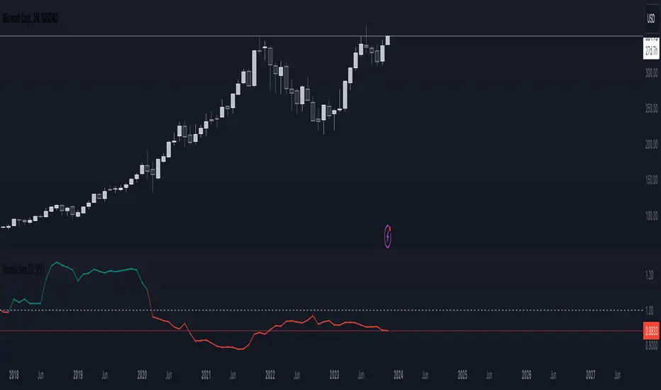
Monthly beta (5Y monthly) with multi-timeframe supportThe PROPER way to calculate beta for a stock using monthly price returns . None of this nonsense using daily returns and sliding windows as done by other scripts...
Works on any timeframe.
This script has been checked against 100s of stocks on Yahoo finance and Zacks research data and matches 100% (some rounding error as this script is kept updated live on unconfirmed monthly bars).
You can check for yourself:
Zacks fundamentals - beta
The script calculates beta using the Variance-Covariance Method as described on Investopedia
How to calculate Beta
VWAP (Any Anchor)Hello Traders,
Introduction:
The Volume Weighted Average Price (VWAP) is a powerful trading indicator used to gauge the average price at which an asset has traded, weighted by volume, over a specific period.
One of the key factors that can significantly impact the effectiveness of VWAP is the concept of "anchoring." In this TradingView indicator script description, we'll explore the concept of anchoring and how it's integrated into a customizable VWAP indicator.
Understanding Anchoring:
Anchoring in VWAP refers to selecting a specific point in time from which the VWAP calculation begins.
This "anchor point" serves as the starting reference for VWAP, and it can substantially impact the indicator's behavior and interpretation.
Anchoring allows traders to adapt VWAP to different trading strategies and scenarios.
Here are some common anchor points used in the script and their significance:
1. Time-Based Anchors: Traders often anchor VWAP to specific times of the trading day, such as the market open (e.g., 9:30 am EST) or close (e.g., 4:00 pm EST).
You could add in the script any time-based anchor you think is relevant for your trading.
2. Event-Based Anchors: Anchoring can also be based on specific market events.
For example, some traders anchor VWAP to events like "3 Consecutive Green Candles" or "Supertrend" direction changes.
Feel free to adapt the script here and add the relevant events-based anchor for your trading.
3. Multi-Timeframe Anchoring: Traders can anchor VWAP on different timeframes, allowing them to analyze price and volume interactions across various horizons.
This flexibility is especially valuable for swing traders adapting to longer-term trends.
Anchor Selection
Traders can choose from various anchor points, including time-based, event-based, and even an "External Connector" for flexibility in adapting VWAP to specific scenarios.
The External connector is the output from another script used in this VWAP script.
Your script may have a condition being “true” whenever a signal is printed - you can use this signal as the anchor for the VWAP.
Conclusion:
Understanding anchoring in VWAP is essential for traders using this indicator effectively.
Choosing and customizing anchor points empowers traders to adapt VWAP to their specific trading styles and strategies.
Whether focused on intraday precision or analyzing longer-term trends, a customizable VWAP indicator with flexible anchoring options can be valuable to your trading toolkit.
Tailor your VWAP to your unique needs and gain deeper insights into market trends and price action.
Made with love
Dave

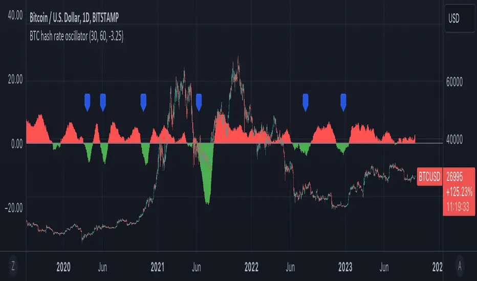
BTC hash rate oscillatorOVERVIEW:
This script looks to identify entry point opportunities when moving averages over Bitcoin's hash rate are indicative of Miner capitulation. The script implements an oscillator based on Charles Capriole's "Hash Ribbons & Bitcoin Bottoms" concept. It analyses the short-term and long-term moving averages of Bitcoin's hash rate and then identifies potential entry opportunities from this.
KEY FEATURES:
Signal Generation: The script identifies entry points when the short-term moving average crosses under the long-term moving average and the rate of change falls below a specified threshold. These conditions suggest potential trading opportunities.
Historical Signals: Optionally the script displays historical signals, indicating past instances where hash rate conditions suggested favourable entry points. Users can also assess the script's historical performance.
USAGE:
The generated opportunities can be used as potential entry points for BTC. The script provides visual cues on the chart (blue labels above the miner capitulation zones) for identification of signals. Customisable moving average lengths and threshold values are supported, which allow adaptation to various strategies.
CONSIDERATIONS:
Validation: It's recommended that careful backtesting over historical data be done before acting on any identified opportunities.
User Discretion: Trading decisions should not rely solely on this script. Users should exercise their judgment and consider market conditions.
Note: This script identifies opportunities based on historical data and should be used with caution, as past performance is not indicative of future results.
Volume Delta Trailing Stop [LuxAlgo]The ' Volume Delta Trailing Stop ' indicator uses Lower Time Frame (LTF) volume delta data which can provide potential entries together with a Volume-Delta based Trailing Stop-line .
🔶 USAGE
Our 'Volume Delta Trailing Stop' script can show potential entries/Stop Loss lines
A trigger line needs to be broken before a position is taken, after which a Volume Delta-controlled Trailing Stop-line is created:
🔶 DETAILS
🔹 Volume rises when bought or sold
🔹 When the opening price appears on the chart, a buy/sell order has been executed.
If that order is less than the available supply of that particular price, volume will rise, without moving the price.
🔹 When the opening price is the same as the closing price, the volume of that bar can be seen as "neutral volume" (nV); nor "up", nor "down" volume.
Example
A buy order doesn't fill the first available supply in the order book. This price will be the opening price with a certain volume.
When at closing time, price still hasn't moved (the first available supply in the order book isn't filled, or no movement downwards),
the closing price will be equal to the opening price, but with volume. This can be seen as "neutral volume (nV)".
🔹 Delta Volume (ΔV): this is "up volume" minus "down volume"
🔹 Standard volume is colored red when closing price is lower than opening price ( = "down volume").
🔹 Standard volume is colored green when closing price is higher OR equal (nV) than opening price ( = "up volume").
🔹 Neutral Volume
The "Neutral-Volume" is considered "Up-Volume" - setting will dictate whether nV is considered as green 'buy' volume or not.
🔶 EXAMPLE
29 July 10:00 -> 10:05, chart timeframe 5 minutes, open 29311.28, close 29313.89
close > open, so the volume (39.55) is colored green ("up volume").
(The Volume script used in the following examples is the open-source publication Volume Columns w. Alerts (V) from LucF )
Let's zoom to the 1-minute TF:
The same period is now divided into more bars, volume direction (color) is dependable on the difference between open and close.
Counting up and down volume gives a more detailed result, it remains in an upward direction though):
(ΔV = +15.51)
Let's further zoom in to the 1-second TF:
The same period is now divided into even more bars (more possibility for changing direction on each bar)
Here we see several bars that haven't moved in price, but they have volume ("neutral" volume).
(neutral volume is coloured light green here, while up volume is coloured darker green)
When we count all green and red volume bars, the result is quite different:
(ΔV = -0.35)
In total more volume is found when price went downwards, yet price went up in these 5 minutes.
-> This is the heart of our publication, when this divergence occurs, you can see a barcolor changement:
• orange: when price went up, but LTF Volume was mainly in a downward direction.
• blue: when price went down, but LTF Volume was mainly in an upwards direction.
When we split the green "up volume" into "up" and "neutral", the difference is even higher
(here "neutral volume" is colored grey):
(ΔV = -12.76; "up" - "down")
🔶 CONCEPTS
bullishBear = current bar is red but LTF volume is in upward direction -> blue bar
bearishBull = current bar is green but LTF volume is in downward direction -> orange bar
🔹 Potential positioning - forming of Trigger-line
When not in position, the script will wait for a divergence between price and volume direction. When found, a Trigger-line will appear:
• at high when a blue bar appears ( bullishBear ).
• at low when an orange bar appears ( bearishBull ).
Next step is when the Trigger-line is broken by close or high/low (settings: Trigger )
Here, the closing price went under the grey Trigger-line -> bearish position:
🔹 Trailing Stop-line
When the Trigger-line is broken, the Trailing Stop-line (TS-line) will start:
• low when bullish position
• high when bearish position
You can choose (settings -> Trigger -> Close or H/L ) whether close price or high/low should break the Trigger-line
When alerts are enabled ("Any alert() function call"), you'll get the following message:
• ' signal up ' when bullish position
• ' signal down' when bearish position
After that, the TS-line will be adjusted when:
• a blue bullishBear bar appears when in bullish position -> lowest of {low , previous blue bar's high or orange bar's low}
• an orange bearishBull bar appears when in bearish position -> highest of {high, previous blue bar's high or orange bar's low}
When alerts are enabled ("Any alert() function call"), and the TS-line is broken, you'll get the following message:
• ' TS-line broken down ' when out bullish position
• ' TS-line broken up ' when out bearish position
🔹 Reference Point
Default the direction of price will be evaluated by comparing closing price with opening price.
When open and close are the same, you'll get "neutral volume".
You can use "previous close" instead (as in built-in volume indicator) to include gaps.
If close equals open , but close is lower than previous close , it will be regarded as " down volume ",
similar, when close is higher than previous close , it will be regarded as " up volume "
Note, the setting applies for the current timeframe AND Lower timeframe:
Based on: " open " (close - open)
Based on: " previous close " (close - previous close)
🔹 Adjustment
When the TS-line changes, this can be adjusted with a percentage of price , or a multiple of " True Range "
Default (Δ line -> Adjustment - 0)
Δ line -> Adjustment 0.03% (of price)
Δ line -> Mult of TR (10)
🔶 SETTINGS
🔹 LTF: choose your Lower TimeFrame: 1S (seconds), 5S, 10S, 15S, 30S, 1 minute)
🔹 Trigger: Choose the trigger for breaking the Trigger-line ; close or H/L (high when bullish position, low when bearish position)
🔹 Δ line ( Trailing Stop-line ): add/subtract an adjustment when the TS-line changes ( default: Adjustment ):
• Adjustment ( default: 0 ): add/subtract an extra % of price
• Mult of TR : add/subtract a multiple of True Range
🔹 Based on: compare closing price against:
• open
• previous close
🔹 "Neutral-Volume" is considered "Up-Volume" : this setting will dictate whether nV is considered as green 'buy' volume or not.
🔶 CONSIDERATIONS
🔹 The lowest LTF (1S) will give you more detail and will get data close to tick data.
However, a maximum of 100,000 intrabars can be used in calculations .
This means on the daily chart you won't see anything since 1 day ~ 86400 seconds. (just over 1 bar)
-> choose a lower chart timeframe, or choose a higher LTF (5S, 10S, ... 1 minute)
🔹 Always choose a LTF lower than the current chart timeframe.
🔹 Pine Script™ code using this request.security_lower_tf() may calculate differently on historical and real-time bars, leading to repainting .
Previous Day ValuesSay hello to the Previous Day Values Indicator, your new best friend in the world of trading. This script, written in the powerful Pine Script version 5, is designed to keep you informed about essential price levels from the previous day's trading session, right on your TradingView chart.
Here's how it works:
The script creates horizontal lines on your chart to represent the previous day's high, low, close, and VWAP (Volume Weighted Average Price) levels. Each level is color-coded for easy identification – red for the high, green for the low, blue for the close, and yellow for the VWAP. The lines extend to the right edge of the chart, allowing you to gauge where the current price stands in relation to these crucial levels.
But what makes this script unique is its ability to update dynamically with each new trading day. At the start of a new day, the script clears the lines from the previous day and draws new ones based on the latest data. It uses the request.security function to fetch the previous day's data for the current symbol, so you can rest assured that your information is always up-to-date.
There's also an added layer of customization built into this script. We understand that different traders might want to focus on different things, which is why we've included toggle options for each value. You can choose whether to display the previous day's high, low, close, or VWAP values, or any combination thereof. Just head to the settings and switch on/off the values you want to see.
The labels for these lines are placed further to the right of the screen for easy reading, without cluttering your chart. And if you're worried about distinguishing between them, don't be! Each label is color-matched to its corresponding line, so you'll know at a glance which is which.
In summary, the Previous Day Values Indicator is a versatile tool that can help you keep track of key price levels from the past trading day. Whether you're a seasoned trader or a beginner, this script is sure to be a valuable addition to your toolkit. Happy Trading!

RSI with J-Line ***For ease of use, I recommend changing the J Histogram to a line indicator, then it works like the KDJ Stochastic indicator. Full disclosure, I created this script with the help of GPT. This script was inspired by the KDJ Stochastic indicator by Dreadblitz***
The "RSI with J-Line" script is essentially a modified Relative Strength Index (RSI) indicator with an added histogram component. Here's how to use the different components of the script:
RSI Line (Blue): The RSI is a momentum oscillator that measures the speed and change of price movements. It oscillates between zero and 100, and is typically used to identify overbought and oversold conditions in a market. Traditionally, readings over 70 are considered overbought, and readings under 30 are considered oversold. However, these are not strict rules and can vary depending on the market and the overall trend.
RSI Smooth Line (Orange): This is the simple moving average of the RSI. It helps to smooth out the RSI and to identify the overall trend of the momentum. When the RSI line crosses above the RSI Smooth line, it might indicate that the momentum is moving upwards. When the RSI line crosses below the RSI Smooth line, it might indicate that the momentum is moving downwards.
RSI J-Line (Red Histogram): The J-Line is an additional line that's calculated as 3*rsiSmooth - 2*rsi. It's similar to the %J line in the Stochastic indicator and is designed to provide quicker signals than the RSI or RSI Smooth line. When the histogram is above the 0 line, it might indicate bullish momentum. When it's below the 0 line, it might indicate bearish momentum.
Please note that these interpretations are standard for these types of indicators, but actual market behavior can be complex and is influenced by many factors. Indicators should be used as part of a comprehensive trading strategy, not in isolation. Always take into account other market information and indicators before making trading decisions.
Volatility Weighted Moving Average + Session Average linesHi Traders !
Just finished my Y2 university finals exams, and thought I would cook up a quick and hopefully useful script.
VWAP + Session Average Lines :
Volatility Weighted Average Price in the standard case is a trading indicator that measures the average trading price for the user defined period, usually a standard session (D timeframe), & is used by traders as a trend confirmation tool.
This VWAP script allows for altering of the session to higher dimensions (D, W, M) or those of lower dimension (H4, or even H1 timeframes), furthermore this script allows the lookback of data to be switched from the standard session to a user defined amount of bars (e.g. the VWAP of 200 bars as opposed to the VWAP of a standard session which contains 95 bars in M15 timeframe for 24/7 traded assets e.g. BTCUSD), lastly this script plots Session VWAP Average Lines (if true in settings) so tradaes can gauge the area of highest liquidity within a session, this can be interpreted as the fair price within a session. If Average lines are increasing and decreasing consistently like a monotonic function this singles traders interest is at higher / lower prices respectively (Bullish / Bearish bias respectively ?), However if Average lines are centered around the same zones without any major fluctuations this signals a ranging market.
VWAP calculation :
VWAP is derived from the ratio of the assets value to total volume of transactions where value is the product of typical price (Average of high, low and close bars / candles) and corresponding bar volume, value can be thought of as the dollar value traded per bar.
How is VWAP used by Institutions / Market movers :
For some context and general information, VWAP is typically used by Market movers (e.g. Hedge funds, Mutual funds ,..., ...) in their trade execution, as trading at the VWAP equals the area of highest market volume, trading in line with the volume of the market reduces transaction costs by minimizing market impact (extra liquidity lowers spreads and lag time between order fills), this overall improves market efficiency.
In my opinion the script is best used with its standard settings on the M15 timeframe, note as of now the script is not functional on certain timeframes, however this script is not intended to be used in these timeframes, i will try fix this code bug as soon as possible.